
The Significance of Color in Coffee Packaging: Unlocking its Potential to Drive Sales
Introduction:
In today’s highly competitive marketplace, distinguishing a product among countless options is crucial for businesses to thrive. Coffee, being one of the most consumed beverages worldwide, demands strategic packaging design to attract and retain customers. While various elements contribute to a product’s appeal, color stands as a powerful tool in shaping consumers’ perceptions and influencing their purchasing decisions. This article critically evaluates the significance of color in coffee packaging and its potential to enhance sales. Here are some points to consider when designing your Coffee packaging.
1. Attention-Grabbing Nature:
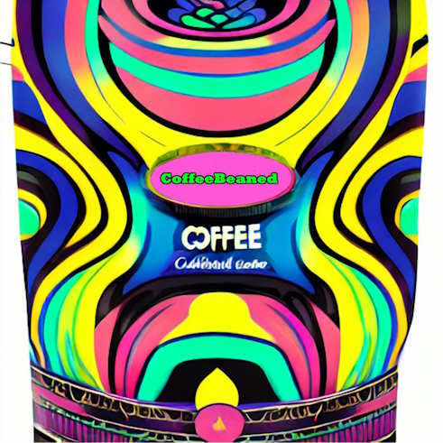
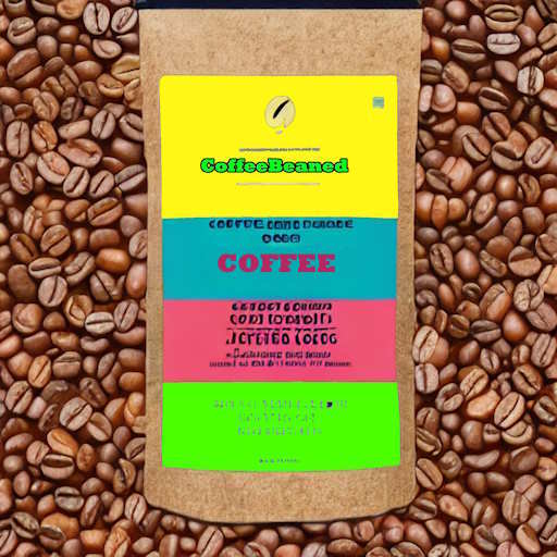
The first and foremost role of color in coffee packaging is to capture the attention of potential buyers amidst the array of options on the shelves. Utilizing vibrant and contrasting colors can effectively differentiate a coffee brand from competitors. Research has shown that bright and eye-catching packaging increases product visibility and attracts consumer attention at first glance. Developers should take into consideration that employing striking colors as focal points on labels, such as vibrant red or golden hues, can significantly enhance product recognition.
2. Emotional Brand Association:
Colors have the innate ability to evoke certain emotions and associations within individuals. Consequently, incorporating color psychology into coffee packaging design enables businesses to evoke specific emotional responses from consumers. For instance, warm colors like oranges and browns often elicit feelings of comfort, warmth, and quality, all of which can align with consumers’ expectations of a satisfying coffee experience. Advanced understanding asserts that the emotional connection formed through color promotes brand loyalty and enhances repeat sales. There are many websites with a breakdown of color meaning, here is one
8 Ways to Use Color Psychology in Marketing
3. Reflecting Brand Identity:
The color scheme used in coffee packaging plays a pivotal role in accurately reflecting a brand’s identity and story. Advanced comprehension allows developers to explore how color aligns with a company’s vision, values, and target audience. Consistency in color selection ensures that packaging aligns with the overall brand message, leading to a recognizable and memorable identity in the minds of consumers. When customers identify with a brand’s values, they are more likely to make repeat purchases and remain loyal to the coffee brand.
4. Shelf Differentiation:
On crowded store shelves, coffee packaging faces fierce competition for consumers’ attention. Intelligent comprehension acknowledges the importance of using unique color schemes to navigate this challenge successfully. By employing innovative color combinations, such as unexpected pairings or trendy hues, coffee packaging can create a distinctive appearance, standing out from competitors. This differentiation helps brands establish a memorable presence and entice potential consumers who might otherwise overlook the product.
5. Consumer Perception and Quality Assessment:
Color is closely associated with perceptions of quality and taste in product packaging. Studies have shown that certain color combinations can significantly impact how consumers perceive the quality and taste profile of coffee. For instance, earthy and darker tones evoke a sense of richness and depth, usually linked to high-quality coffee. By utilizing such colors, the significance of Color in Coffee Packaging can influence customers’ perception of the product’s taste and ultimately drive sales through perceived value.
6. Cultural Relevance and International Appeal:
The global coffee market is highly diverse, with coffee being an integral part of various cultures. Designers must comprehend the importance of considering cultural relevance when designing packaging. By utilizing colors associated with cultural traditions and symbolism, coffee packaging can establish a stronger connection with specific target markets. This cultural relevance helps companies expand their reach, increase market share, and enhance sales by appealing to consumers’ sense of familiarity and identity.
7. Creating an Emotional Experience:Recognize the importance of creating an emotional experience through product packaging. By utilizing specific colors, coffee packaging can evoke specific emotions and enhance the overall consumer experience. For example, cool blues and greens may evoke feelings of freshness and relaxation, aligning with the soothing ambiance that consumers often seek when enjoying their coffee. This emotional connection elevates the brand beyond a mere product and cultivates a sense of loyalty and advocacy among coffee enthusiasts.
8. Instant Brand Recognition:
In a saturated market, brand recognition is essential to driving sales. Understand the importance that color plays a crucial role in achieving instant brand recognition. By consistently utilizing a specific color palette across various packaging designs and marketing materials, coffee brands can become instantly recognizable in consumers’ minds. When customers effortlessly associate the significance of color in Coffee packaging with a particular brand, purchasing decisions become faster and more instinctive, leading to increased sales.
9. Accessibility for Consumers:
The color scheme employed in coffee packaging can also contribute to enhancing accessibility for diverse consumer groups. Comprehending the relevance of color schemes in coffee packaging is crucial for consumers with visual impairments. By using high contrast colors, such as black and white, or bold and vibrant colors, coffee brands can ensure that visually impaired individuals can easily distinguish between different coffee products. Additionally, incorporating braille labels or embossed textures on the packaging can further enhance accessibility for consumers with visual impairments. By considering the needs of diverse consumer groups, coffee brands can create packaging that is not only visually appealing but also inclusive and accessible to all.
You can review hundreds on Coffee packages on Coffeebeaned’s webpage here: Coffee Packaging Gallery